
|
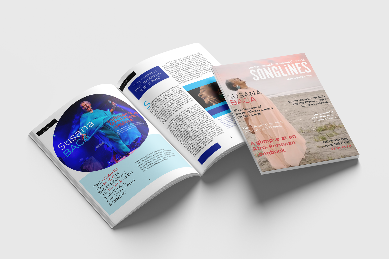  I worked on a project where I created an interactive EPUB magazine spread. The magazine has live hyperlinks that take readers to the website, and an embedded YouTube video featuring the artist on the cover. Also, I created an interactive Table of Contents where readers can click on the hyperlinks to access online articles.The magazine I chose for this project is called Songlines, a music publication that has adapted to the changing times. However, I believe that there is still room for improvement. Creating a digital and interactive version of the magazine can increase engagement among current subscribers and attract a younger audience. By incorporating interactive features such as videos, song samples, and a playlist, we can increase the number of subscribers. 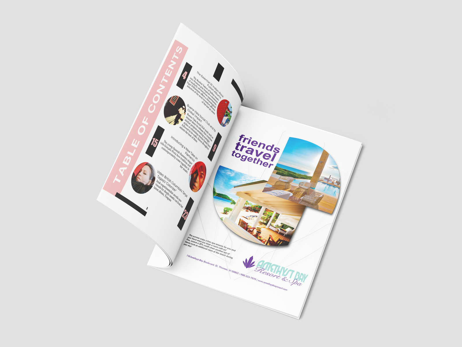   This is a campaign ad to promote group travels and boost bookings for a resort. To draw attention to the business name and address, I placed the campaign details at the bottom left of the page. The clear blue waters and sunny skies inspired me to select two images for the magazine ad. Using Adobe Photoshop, I edited both photos by adding a New Adjustment Layer for each photo to make changes to the Vibrance, Brightness, or Contrast levels without damaging the original image. The Web Banner is a continuation of the Magazine ad for online promotion. 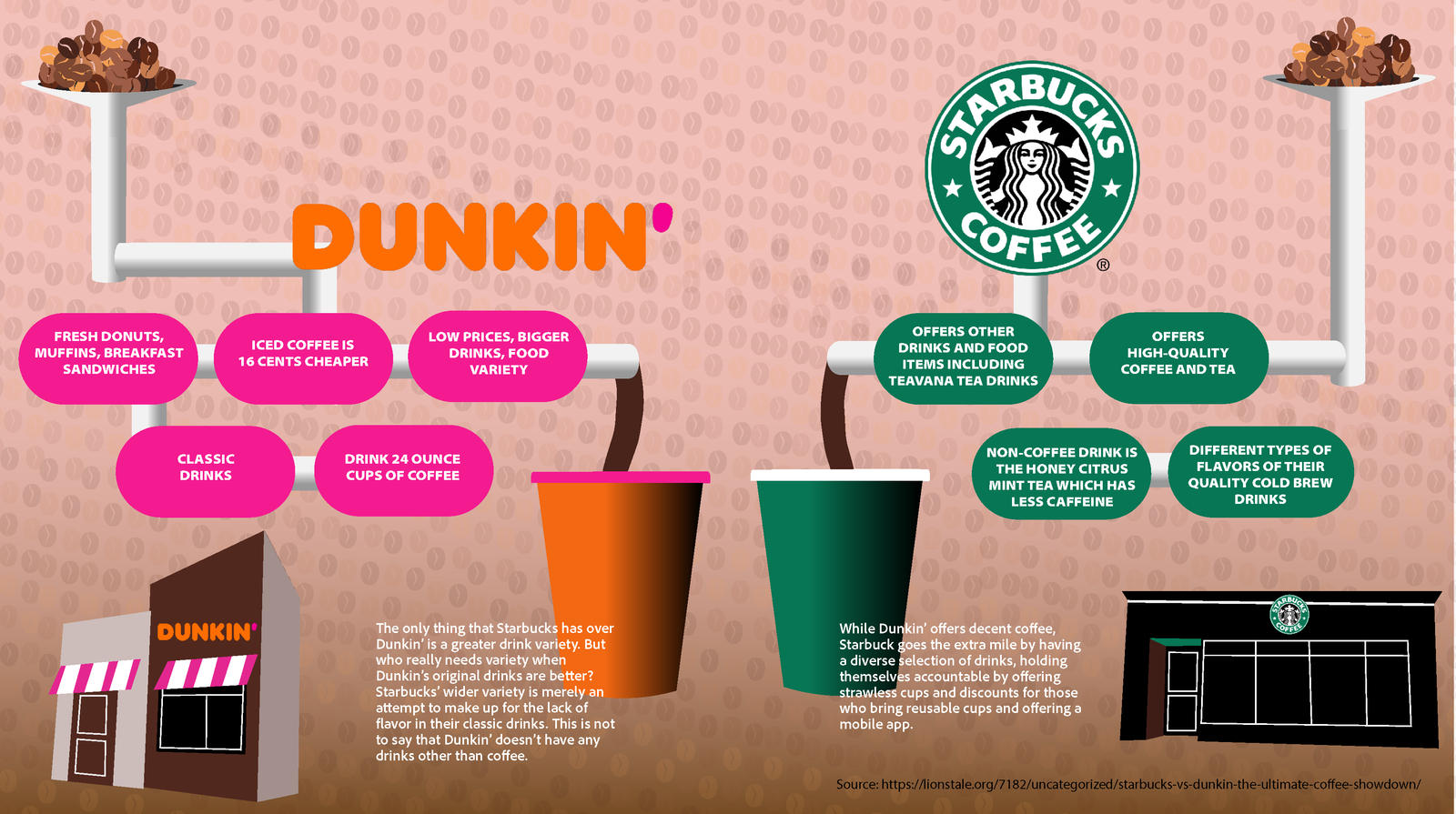 
An infographic was created to illustrate the reasons why coffee e nthusiasts prefer either Dunkin’ or Starbucks. Adobe Illustrator and Photoshop were used in combination to create the graphic. Illustrator was used to produce vector images that were later transferred to Photoshop. Photoshop was used to create an animation sequence where coffee beans flowed down through a funnel and into each coffee cup. The infographic showcases my animation skills with Adobe Photoshop as a medium.  I chose the Cochin typeface to create a typographic portrait of my favorite architect, Antoni Guadí from Spain. Georges Peignot designed Cochin in 1912, and it’s still in use today after being adapted. To create a supportive background image of my subject, I used Adobe Photoshop to convert the original photograph into a black-and-white image. I used the contrast and brightness tool to create darker and lighter shades.The eyes are the focal point of the portrait. That’s why I left a generous white space between the facial features and hair elements in the portrait. The idea is to draw the audience to the center of the portrait and then work and expand outwardly.. 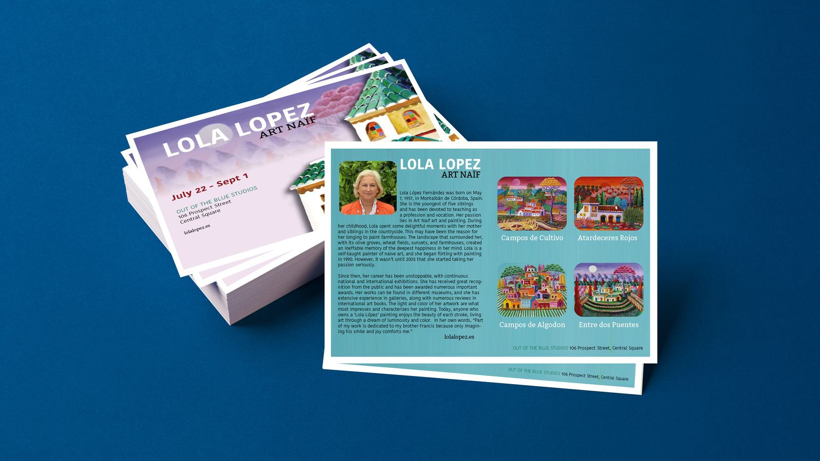 FAn infographic was created to illustrate the reasons why coffee e nthusiasts prefer either Dunkin’ or Starbucks. Adobe Illustrator and Photoshop were used in combination to create the graphic. Illustrator was used to produce vector images that were later transferred to Photoshop. Photoshop was used to create an animation sequence where coffee beans flowed down through a funnel and into each coffee cup. The infographic showcases my animation skills with Adobe Photoshop as a medium. The picture on the left features an icon designed for the artist’s social media profile which is still in use.  I redesigned a prototype for a Russian oatmeal company by altering the color scheme and layout of their product packaging. To ensure consistency throughout the design, I utilized Adobe Illustrator to preserve the sharpness of the small print on the packaging. Furthermore, my knowledge of typography enabled me to choose the appropriate fonts for the design, while using grids to achieve balance between repetitive elements and illustrations. 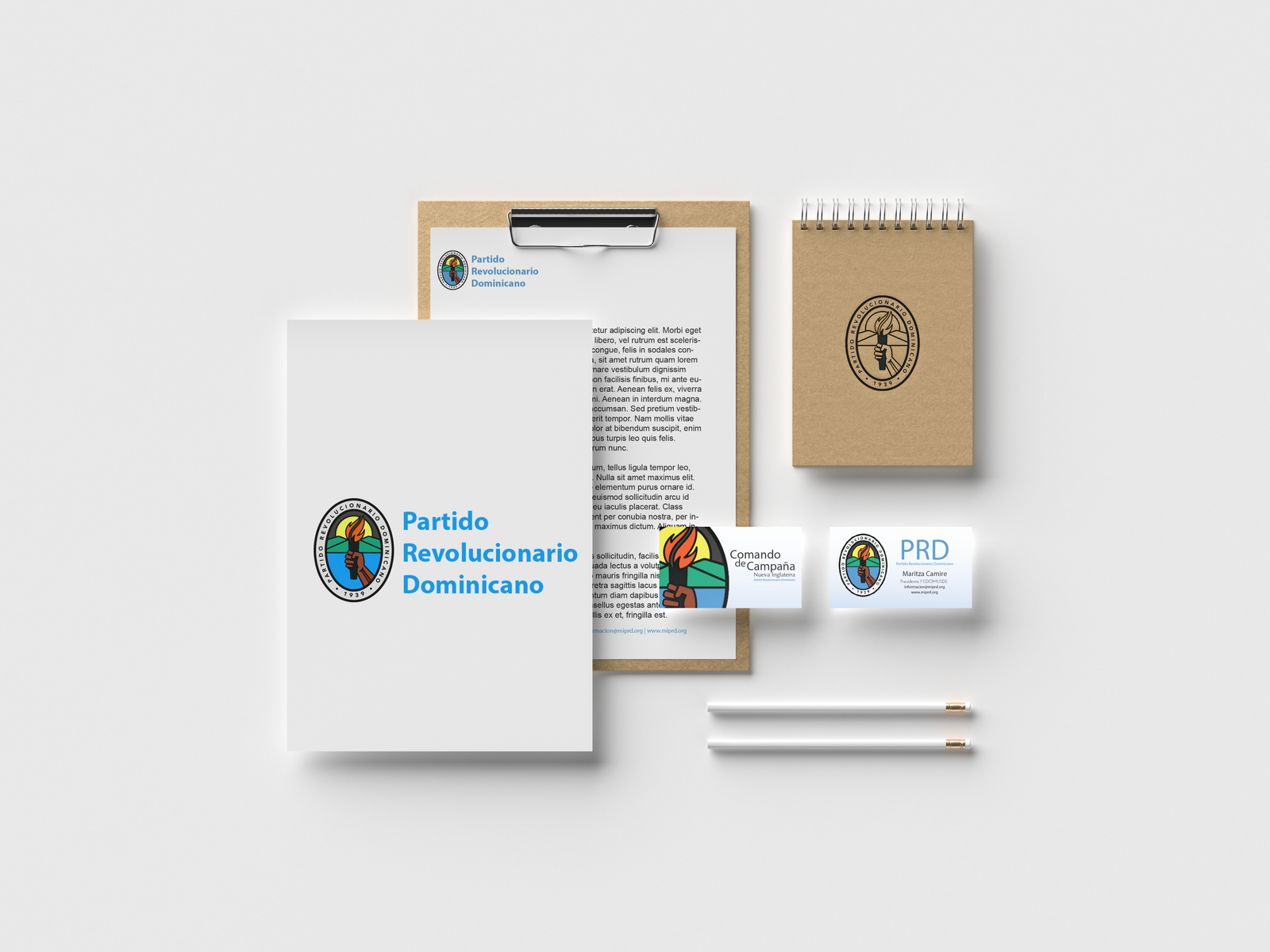 This is a design made for a Political Party based in the Dominican Republic. The Regional Campaign President commissioned a youthful version of their business cards. A combination of Photoshop and InDesign was used to create this piece. The final design was used for the political campaign across several Dominican communities in New England and was later requested by the New England chapter for future campaigns. The Youth Chapter for a Political Party created a letterhead to invite young adults in New England to vote for a candidate. The blue variations in the design minimize color bleed during printing. The letterhead has fewer colors to make it less distracting when reading text. 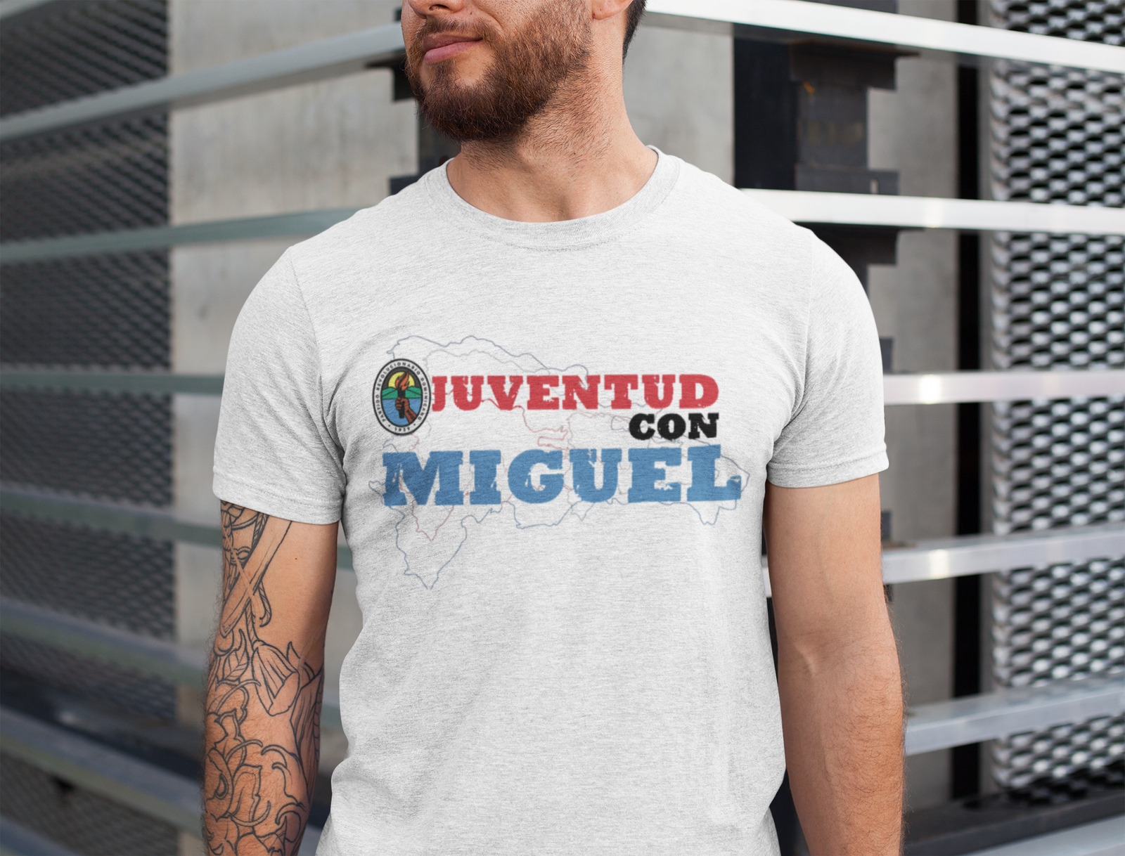  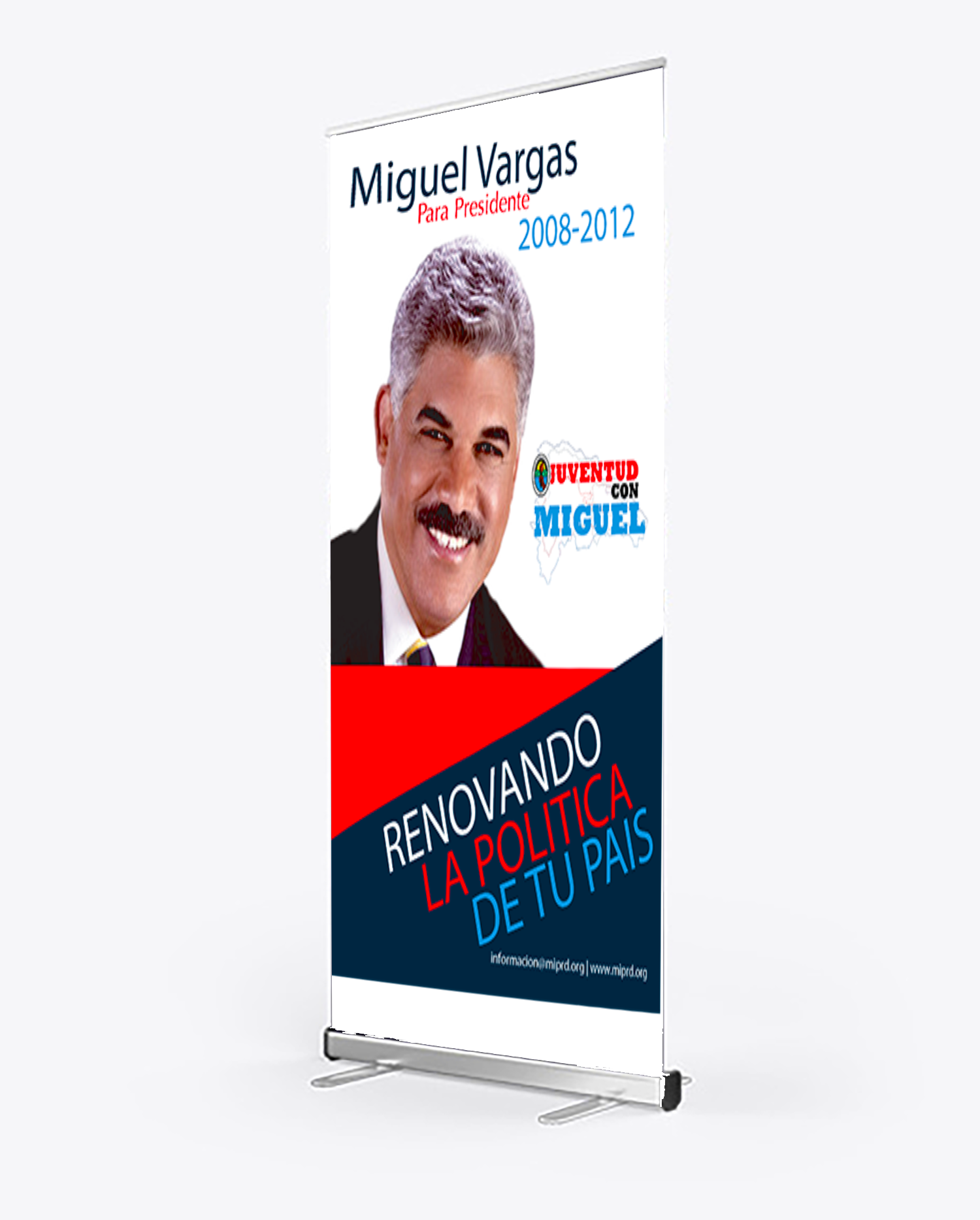 This design is part of a revalidation effort for a Political Party based in the Dominican Republic. The Regional Campaign President located in Lawrence, Massachusetts commissioned a more youthful take on their branding. This series features, a political poster, t-shirt design, and election yard poster. The poster is in tabloid size, 11x17 and was distributed in various local businesses as part of a political campaign in an effort to encourage Dominican citizens to vote as an absentee for the running candidate in the image. Photoshop was used to extract the political candidate’s image.  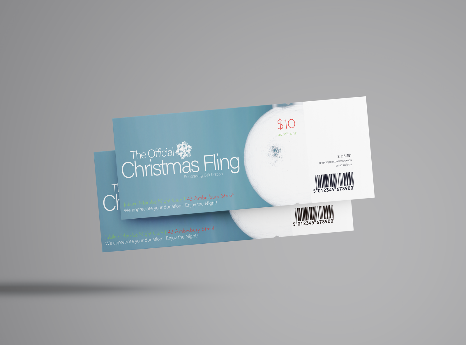 The 11x17 tabloid poster was created for a fundrasing Christmas Party. The night club were the party was held was in dire need of promotion since it fairly new to the city. Several local businesses contributed by donating funds to cover expenses in designing, printing and distibuting the poster throughout the city. Each business that contributed are listed at the bottom of the poster. The image on the left features the admission tickets for the event.  
This project is to demonstrate my JavaScript, HTML, and CSS experience. I added several JavaScript forms to the website by adding input forms. The design process started with the site’s homepage; created by making it the index.html file. Using Adobe Dreamweaver, I managed to add a background image to the site. This step was achieved by using the Bootstrap CCS framework since I plan to use the same image for all pages. Preliminary pages for the “About Us/Vision”, “Contact Us”, and “Booking” was created. In addition, I worked on the navigation bar by adding links to the mentioned subpages which required some work since I used a Bootstrap plug-in. |
Photography |